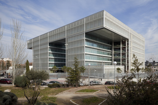
Text description provided by the architects. We initially conceive the project as a whole extending from plot to plot in a way which users and visitors experience as natural and easily recognizable. Thus we suggested building a series office blocks which would form an interwoven whole. The other option, a single large building, was discarded to make room for a more versatile, flexible and domestic option. In this sense we prefer here to work around a formula rather than a form, taking as starting point a typological approach rather than an image. After discarding any solution which did not include the North-South orientation of the offices, an interwoven complex has taken its place which follows a trefoil formation in its ordering of the different office blocks. This is done to avoid that the building cast shadows on each other. In this chess-table disposition, the blocks both express their individuality and interdependence under a higher-order principle. The whole is unified through the bottom and top floors. Base and culmination provide the common link, the element that makes them one.
Because of their size, the building in the calle Luca de Tena is dismembered into three units, while the building of Abelias consists of one unit. The unity of this collection of buildings and the singularity of the different pieces add to each other in a playful exchange of strong contrasts. Positive and negative appears as a result of the juxtaposition of empty and full, leaning and flying, static and dynamic, patios and blocks, which is perceived as a disquieting display of airborne shapes, one which invites us to experience contrasting compounds of serenity and mobility, security and surprise. The pattern is transferred from one plot to the next without losing any of its coherence. In both plots the buildings face North and South in perpendicular communication, although the top and bottom floors are responsible for allowing to acommodate the strategy to the individual case and situation.
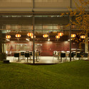
The headquarters of the Banco Popular has to be understood as a whole, a single gesture which defines its occupants. Both the strategy behind it as well as its formal development leap from one to the other side of the motorway, and are recognizable in both buildings. Typologically the building operates like a comb. The arrangement of the blocks allows its division into distinctive areas or integration with others so that the weaving strategy can be applied in different ways to floors, blocks, combs… The result is a whole that guarantees maximum flexibility. The arrangement entails the creation of patios over which the offices orbit. The patios are placed alternatively over the weaving structure, singled out in such a way that each can be recognized by its users, which avoids the typical confusion in this kind of buildings. The patios attract the architectural attention of the building. In them, or around them, meeting, rest and communication spaces are created, spaces in which the casual character of the activity is promoted with the presence of light and greenery. The gardens of these patios are the most memorable aspect visitors will take with them when they leave the building. The offices empty out on these patios in search of scenery and light. In this context, we recall Sota’s “Where the sun comes in, doctors don’t enter”.
Orienting the building along a north-South axis is mandatory. This is not just a matter of consuming less energy, given more natural light hours. Orienting the building in this way improves office work, especially where people work with computers. It is evident that the repercussion of the façade prize per office m2 has to be harmonized with the well-being that a work space can offer, or, in other words, the quality of the light and the scenery to which the work space is exposed. This why we thought of a bay of 14,8 m breadth with light sources between 13 m supports. This creates an open and illuminated space, devoid of unnecessary elements and dark areas. Within this scheme a view of a transparent and open office-scape opens up. Via the open design of the space communication and interaction are promoted as necessary conditions for group work.
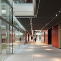
The different blocks are articulated along a series of longitudinal pieces which communicate the blocks perpendicularly, much as “spines” would. Here the centers of vertical communication are housed. These spines are the fix points that organize the floor as social foci, showing how to get from one block to the other and serving as rest and meeting places. Vertical transit has been encouraged enormously via the use of stairs. Apart from the energy efficiency of not having to use the elevator all the time, it improves the flexibility of floor use, the exchange between areas, as well as increasing the possibility of personal relationships. Footbridges and stairs alternate in a playful exchange of voids which lean out onto each other, and which will turn this space into an architectonic spectacle for visitors who, be it from the patio or the street look on the comings and goings along the corridors. The skin that envelops these volumes operates by catching the light and reflecting it as toned down shimmering. We are talking here of a series of solar reflectors made of ceramic cylinders which can control the light, and which in turn produce a velvety color play.